Design Philosophy
To design my website I first started with making all the pages, having just head tag linking it to the style sheet, and a heading for the page. I then made a skeleton layout for my website based on the home page so I could determine what the layout and css of my website would look like. After I had this skeleton done I wrote the content for the website.
I think overall my website is rather simple, but well executed as seems to be the scope for this assignment. It's rather aesthetically pleasing, and dare I say deserving of a High Distinction. I'm rather happy with what I've made, and although there could be more content, especially on the past and furture pages I find what is there quite comedic and entertaining.
Technical Details
All of my pages are structured as all html pages should be, with a head for meta information, and a body for what the user sees. Because all the pages of my website use the same base, they all have the same 3 tags in the head.
<link> is used to reference the style sheet for the page, it's the reason why the word link can be fancy and this section can be green.
<title> is used to control the name of the web page to your browser, this is what appears as the tab lable, in history, and what the window is named when you have the page opened (depending on browser)
<meta> is the last tag used, and is used to set the page's view port to the device viewing it, this allows text and other items on the page to be the right size relative to the device size, especially on mobile.
The body's of the pages mainly use <p>, <div>, and semantic tags
<p> tags allow for the paragrph text you are reading right now.
<div> has been used to organise some parts of the website, this is often useful for applying specific css through classes to areas of the website.
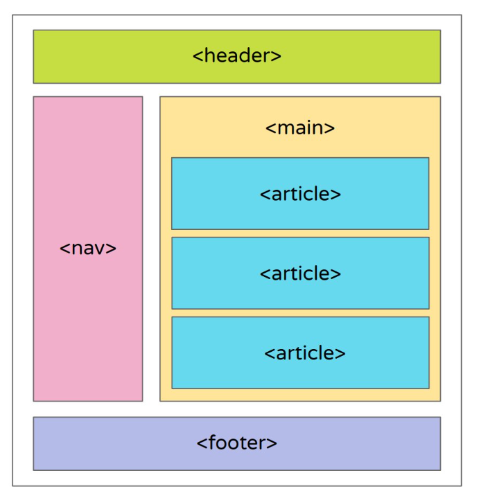
Sematic tags are new in HTML5, and replace some roles of the <div> tag. Sematic tags are used for organising the layout of your website. I've used <nav>, <header>, <main>, <article>, and <footer>. The reason for using these is that they tell your browser what part of the website is what. This is often useful for navigation and has accessibility implications.
This image here, courtersy of twitter user @NanouuSymeon helped me to understand where each of these tags go and gave me an idea of how I should lay out my website
In all the css for the website is ~120 lines long. I've used many classes to control specific sections of the webstie, as we as regular element selection to make the whole website consistant. The use of semetic tags helped me cut down on the use of some divs and classes I would have otherwise had to use, instead the css for the navigation and footer is just done directly with the nav and footer selector tags. For the navigation bar I've used the :hover selector to make it clear which page the use is selecting. I've used CSS to customise font and color of text, I also used it to give the title of my pages a nice shadow.
Aesthetics
Throughout the process of making my website I've wanted it to look somewhat visually appealing. This is why I started with a skeleton website that I could tweak aesthetically until I was happy before writing the content. The skeleton also allowed me to have a consistant layout and theme across all of my pages, something that's very important in making a cohesive website.
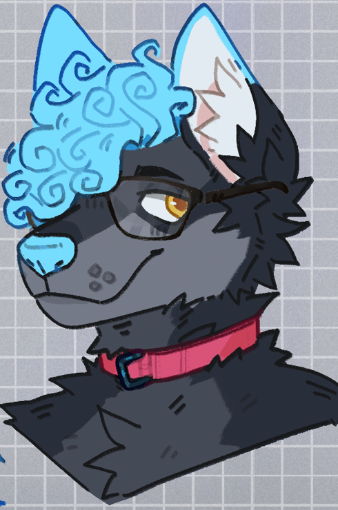
The colour scheme for this website is based off my fursona. I choose to do this because it would add a personal touch to my website, and I knew that the colours would already work nicely together. I used a colour picker tool to get a palette of grays and the accent blue for the website. From there I experimented with which grey to make different parts of the website. Should the page background be darker than the content background? In the end the content background is dark which works better as there's more contrast with the white text. Art by @MoistPamphlets on twitter.
The green of the text above in the Technical section is a reference to the green and black terminals programmers are often seen writing in in movies, generally I actually strongly dislike dark mode for text editing, however the dark tones on this website are calm and work well with each other and are easy on the eyes.
As for the font choice, the navigation is a clean sans-serif font which draws the users attention to in when they open the page. The title is a monospace font which is reminiscent of the task itself, being the font that terminals and IDEs use. That's also why the html tags in the technical details are monospace, which also helps identify them as something special in the page. The main content of the page is serif to aid with readability.
Accessibility
A number of things have been done to make sure the website is accessible. Firstly the navigation is done with lists, meaning the page can be navigated using the tab button. Due to the use of semantic tags, software such as screen readers are able to determine what is what in the page, meaning that sections of the page can be easily found and read by visually impared people. Additionally all images on the website have an alt attribute, which gives a text description of the image which can be used by screen readers. It is also useful for people with slow connections or if the image source is not avaliable.
The webpage has been tested at a variaty of screen widths as well as on different browsers. Mobile viewing initially proved a problem, but this was fixed with the inclusion of the viewport.